
Readers wanted to see the photos that go with this story, about the prisoner-altered State Police car-door decal in Vermont. It ran in True’s 12 February 2012 issue:
A Different Kind of Corrections
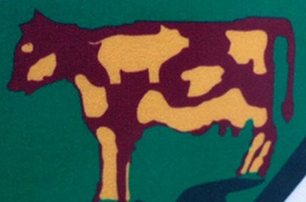
Vermont State Police Sgt. Michael Roy noticed something odd on a decal on his police car: One of the spots on the cow in the state seal had taken on the shape of Sus scrofa domesticus. That’s a pig, as in the derogatory term for a cop. Investigation found that it had been that way for several years; a prison inmate-artist had changed the insignia on the prison-made decals. Authorities say they will hunt down all the altered decals. “It’s going to be ‘Where’s Porky?’ instead of ‘Where’s Waldo?'” said an ex-cop turned state legislator; they guess there may be about 60 in circulation. Replacing them will cost taxpayers $13 per decal. What, if anything, it costs the offender may depend on whether he’s still inside and thus subject to prison discipline. “I don’t know if there is a criminal charge,” said the state corrections commissioner, but investigators say it will take “weeks” to sort it all out. (AC/Burlington Free Press) …I can’t wait till someone gets a good look at the prison guards’ shoulder patches.
The Photos
What the Vermont State Police decals are supposed to look like — right from their web site:
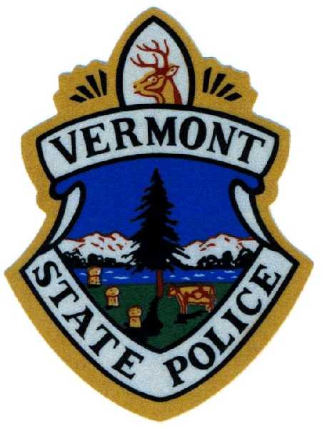
The cow and three sheaves of wheat (no, those aren’t giant toadstools) are supposed to represent the state’s dairy and agriculture industries.
But a prison inmate altered the cow on the seal just slightly:
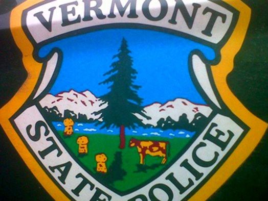
A closeup of that altered cow:
The Update
The investigation is now closed. It was determined that the alteration was made in November 2009 by an unknown female inmate at a prison work center in Windsor, Vermont.
“At this point all we can tell is how many women had access to the file, and who they were,” said Corrections Commissioner Andy Pallito. “Really being able to tell who manipulated the file last is virtually impossible without somebody stepping forward and saying ‘I did it’.”
Except whoever made the alteration wasn’t necessarily the “last” one in the file, eh Andy?
At least one resident is campaigning for the state police to keep the altered decal as official.
“It is a really good opportunity for us to band together as Vermonters and show that we can have a laugh in a little bit of an awkward situation,” says Cid Sinclair, who has created a Facebook group, Save the Vermont Pigs. Well over 1,000 people have “Liked” the page. Sinclair has also created a petition to demand that the governor adopt the decal, rather than spend tax money to fix it. Hundreds have signed.
He has the backing of Lt. Governor Phil Scott, at least. He “loves” the idea, and says the prisoner’s alteration was “disrespectful,” but “We cannot let them win and if you let it bother you then they’ve won.”
The state police, however, have refused to comment on the suggestion. Apparently the picops prefer to let “them” win. Hey: don’t have a cow, man!
(Update source: WCAX-TV, Burlington)
– – –
Bad link? Broken image? Other problem on this page? Let Me Know, and thanks.
This page is an example of Randy Cassingham’s style of “Thought-Provoking Entertainment”. His This is True is an email newsletter that uses “weird news” as a vehicle to explore the human condition in an entertaining way. If that sounds good, click here to open a subscribe form.
To really support This is True, you’re invited to sign up for a subscription to the much-expanded Premium edition.
It almost looks like there’s somebody’s profile on the right of the cow, maybe the inmate in question? Or given that it’s on the cow’s rump, maybe not?
And in the center, that could be a bird in flight.
All three spots look pretty close to the official patch though.
—
Yeah, the “head” appears to be from the original. I noticed it too. Being on the cow’s ass, it probably is homage to a former governor…. -rc
Unless there is some form of punishment handed down, it is a win-win situation for the prisoners. Whether the state leaves the emblem as-is, even to the point of “liking” it, or whether they spend more of the taxpayers money having it redone, the prisoners have won. I say (threaten to) punish everyone who had contact with that emblem during the design process and see who ultimately gets ratted out as the culprit.
The cow’s head looks like a pig’s head in my opinion.
—
“Look at this ink blot, and tell me what you see….” -rc
November 2009, huh? So “obvious,” it took them over two years to notice it? I’m looking right at it, and still not seeing it. Sounds a little like the Supreme Court’s definition of “obscenity.”
Still, for irony, it’s hard to beat next-door New Hampshire’s motto stamped on every license plate, “Live Free Or Die.” And made by prisoners….
Mike: Look at the spots, not at the cow itself.
If they fix the cow, they’ll just tweak the sheaves of wheat to something a tad more phallic.
All they have to is put underneath it is the letters: PIG: Pride — Integrity — Guts.
Keep the pig. Here in Sacramento there is an annual football game for charity between the city cops and the county sheriff deputies. They proundly call it “The Pig Bowl”.
The pig silhouette is the most artistic and accurate element of the “art” work. The rest is pretty lame. What are those three blueberry muffins doing on the left side of the emblem? Or are they pieces of cinnamon toast? What, they’re supposed to be harvested corn or wheat? It doesn’t look a thing like them.
I’m thinking that the face on the cow’s flank is Olive Oyl, from the Popeye cartoons. I think they ought to get the prisoners (or someone) to redraw the whole thing.
The pine tree’s levitating, too. 🙂
Just to clarify: I SAW it. Had to work at it, which means so did somebody else. And the figure on the flank puts me in mind of an Archie profile. Which means we see pretty much what we WANT to see.
No one’s said anything about the police cap below the pig yet….
Cathy in Texas is right — the tree IS levitating in the “pig” version. Look at the boundary between the trunk and the shadow in both versions. I didn’t spot that at first.
Everybody has been concentrating on the pig so much that they’ve missed the other change — the blotch facing the ‘pig’ seems to have been altered to look like a silhouette of a girl’s head. Although the pic of the original is pretty small, the outline looks distinctly different.
And they’re facing off over top of a chef’s hat! ;-D
What intrigues me is why and how inmates ended up (re)designing the motto in the first place. Randy, any info available about that?
—
I presume (and yeah, I know: when you presume, you make a pre out of u and me) that like license plates, the decals are made in the prison. That requires source files, and apparently the prison workers had access to the computer where the source files were stored, and had the ability to “update” those files before printing. And did. -rc
Vermont, huh?
Isn’t that one of the former colonies that adopted “Yankee Doodle” as a mark of pride when the Brits tried to shame us with that name?
Maybe this could be used as a new Rorschach test?
—
Yankee Doodle went through town / riding in a cruiser / found a piggie on the door / and took it as a bruiser. -rc
I live in southwestern New Hampshire where virtually all my day to day shopping and other business is conducted across the river in Vermont. Just after news of this broke, two VT State cruisers followed a vehicle with an expired sticker into the busy, Saturday morning recycling-center parking lot. The two cruisers were immediately surrounded with gawkers (me included) to see the pig shape on their doors. They could barely issue a ticket amongst the laughing. I hope they keep it that way, but their laughing doesn’t sound the same as ours.
I can recall when a number of law enforcement officers and supporters wore t-shirts and belt buckles which read: “PIG: Pride, Integrity, Guts”. Perhaps it’s time to bring that back — and leave the patch as it is.
“No one’s said anything about the police cap below the pig yet….”
It seems some people are delusional. The spot underneath the pig’s rump isn’t even close to a police cap. That’s because it’s a t-bone steak.
About the chef’s hat — isn’t that called a “toque”? (Not to be confused with a “toke”.) Maybe our prison artist just likes a good pun.
This is so subtle even the person(s) applying the decal apparently didn’t notice. Perhaps what the Vermont officials need to do is acknowledge this by incorporating other designs into the cow artwork that also has an agriculture theme. Also those sheaves of wheat don’t scale down well. Replace them with something larger and easier to see. The big lesson is: never trust inmates.
Look closely. In spite of the lower resolution of the original, it’s easy to see that the “pig” decal isn’t a modification, it’s a complete redraw.
For starters, the lettering in the original has pointed serifs, and is obviously hand drawn (compare the three E’s), while the pig version has rounded serifs and the consistency of computer generated type. There are also multitudinous differences in the shapes of and markings on all of the graphic elements.
Perhaps one or more inmate artist was tasked with cleaning up the graphics and took a little artistic license. The shape of the original spot on the cow looks a lot like a bear petroglyph, so a pig isn’t that much of a stretch.
The spot in the center looks like it has definitely been changed to resemble a poilce officers cap. In the original it looks more like a blob.
Korey — The first version is a patch (fabric or embroidery). The second is an actual decal (paper or vinyl). That accounts for the kind of differences you’re listing.
The sheaves of wheat look like champagne corks.
Maybe the woman responsible “signed” it by putting her silhouette on the cow by the tail. The changed version looks more like a side view of a head the one in the original version.
—
Hard to tell, but that would be hilarious! -rc